Design Brief: Our Sub-Zero & Wolf Kitchen Design Contest Winner
For more than 20 years the annual Sub-Zero and Wolf Kitchen Design Contest has been recognizing the world’s best kitchen design. This prestigious, global contest is judged by a panel of world-class architects and kitchen design professionals. This kitchen won a Southwest Regional Top Kitchen Design award and we couldn’t be more proud of our team.
We asked our designers to tell us about how they turned their client’s initial spark of an idea into this beautiful, functional and award-winning kitchen.

What were the client’s goals for the kitchen?
Our client was primarily focused on the aesthetic. She gave us a collection of inspirational photos (all of them very industrial and modern) and really allowed us to run with that basic idea and to build on it.Were there any unique challenges?
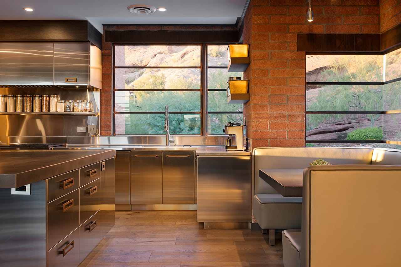
There were definitely some challenges in the original space. The home was built in the late 90s and had very outdated interior architecture – very small and cramped feeling. The wall between the kitchen and great room made the space small and closed in. Short exterior windows made the space dark and didn’t provide a sufficient view of the beautiful mountain scenery. Functionally speaking, the limited number of interior walls didn’t offer many storage opportunities in the kitchen, so we added shallow pantries to the adjacent hallway. This solution keeps the walkway open while adding substantial storage space.Our client loves to sit and drink coffee in her nook and enjoy the dramatic mountain view through her new, larger windows.

How did you meet the client’s goals?
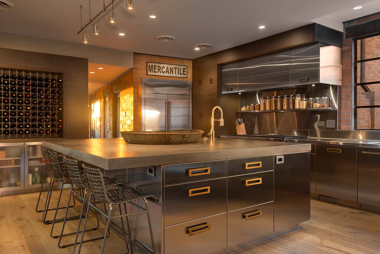
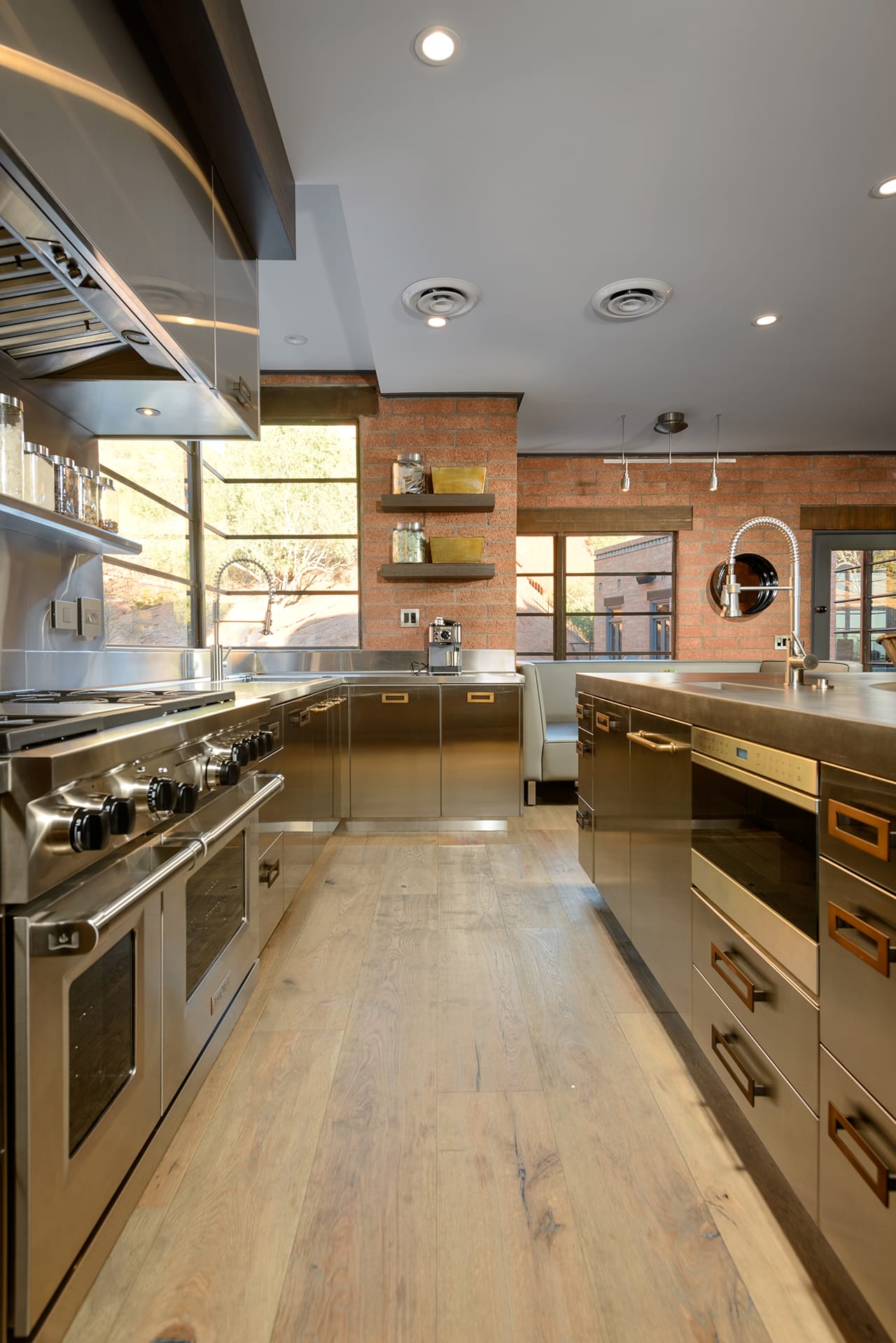
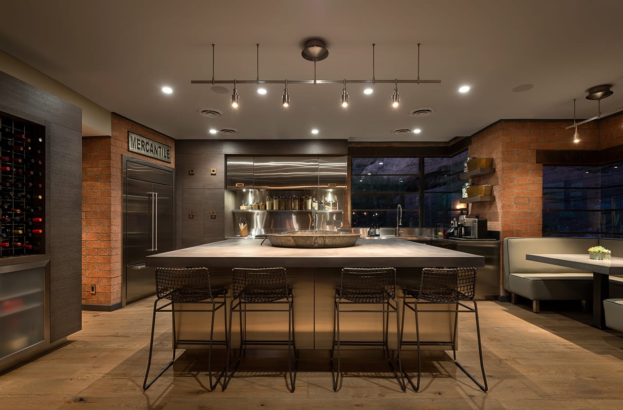
Beyond the initial inspiration, our client really gave us free reign to design around that industrial style. I mentioned earlier that the windows were very short – our first recommendation was to put taller windows throughout the kitchen area to help bring the mountain scenery. This included expanding existing windows and adding new ones. We also removed the wall between the kitchen and great room to open up the space. That had an immediate impact on how the space felt. The existing brick walls gave us a great backdrop for an industrial look. We started with stainless cabinetry and added wire-brushed oak to help soften the metal. It was important to add warm and organic elements to keep the industrial look from feeling cold and impersonal. The concrete countertops add some additional organic feel and brings some of the natural tones of the outside landscape into the kitchen. There was quite a bit of back-and-forth on hardware selections. We wanted it to be very discreet to avoid pulling too much attention from the stainless cabinetry. In the end, we selected burnished gold hardware for a subtle complement to the silver stainless.Appliances are set into the island for convenient access and to keep the countertops clear. Dual sinks make it easy for more than one person to help with food prep.

How did you integrate appliances and technology with the design?
The current trend is to make the appliances disappear, but we really wanted them to stand out in this kitchen. It really started with the top-of-the-line refrigerator. We installed it flush with the wall (inset) and built a custom stainless frame to add some scale and make it a strong visual element. The stainless ice maker and microwave are integrated into the island, flush mounted and placed for convenience. The space over the range offered another opportunity for a strong visual to complement the stainless cabinetry. While the mechanical part of the hood is limited to the space above the range, we were able to create a dramatic, linear piece by adding additional stainless panels with wall storage on either side of the fan. We didn’t want typical wine storage in this space, so we we looked to restaurants, bars and lounges for inspiration. The result was this oversized wine wall which brings substantial bottle storage and visual interest. We love working with Sub-Zero and Wolf appliances because of the quality and design options. We know that if we recommend Sub-Zero and Wolf to a client, we can confident that the appliances will last. One thing people might not know is how much flexibility Sub-Zero and Wolf offer in terms of design. We can use their appliances in all design styles from from traditional to ultra contemporary and they offer many options for appliance size, handles and more.The oversized stainless hood (with hidden storage) and led lighting (recessed and task lights) add drama and function.

What Other Functional Details Would you Like to Highlight?
Every cabinet in the Island is a drawer. We added a shelf above the cooktop for easy access to spices and to keep the food prep area wide open. The tall cabinet pantry next to the fridge created a border for all the stainless elements and gives the homeowner ample storage for dishes and cookware.What is your favorite part of the new kitchen?
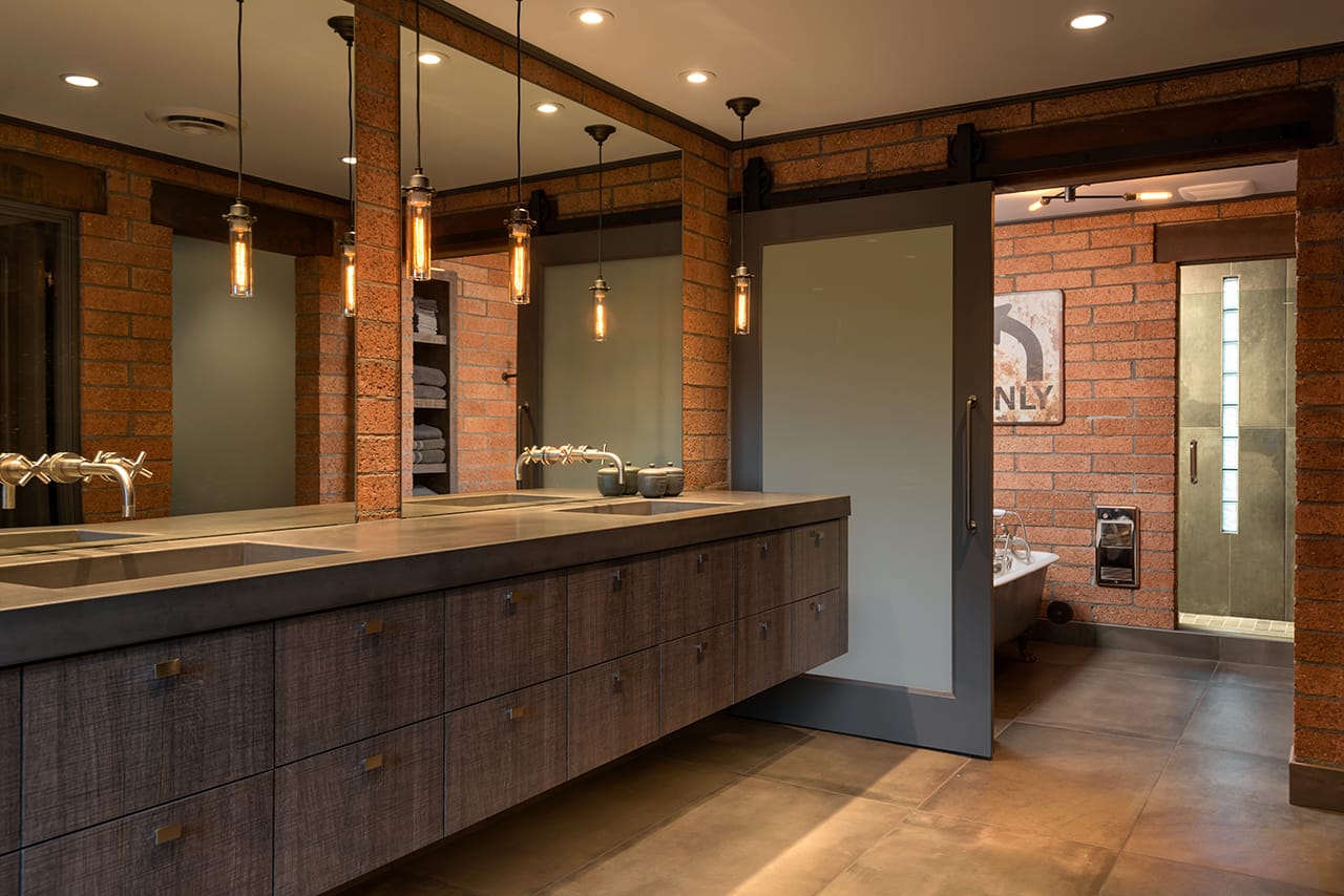
I love the contrast of warm brick and wood with the concrete and cool metals – it really feels like the perfect mix of materials. My absolute favorite area in the kitchen is the bench seating in the nook where our client can sit every morning and drink her coffee with dramatic view of the pool and mountain landscape. Our client cooks every day and thinks the space is great for entertaining. She calls it “the perfect kitchen.”We designed several other spaces in the home including the Master Bath. The floating vanity works with the contemporary look. We love the private wet room with a door between it and the vanity.

Connect with a Professional Designer at Affinity
Let’s make your dream kitchen or bath a reality.